IP Calculator
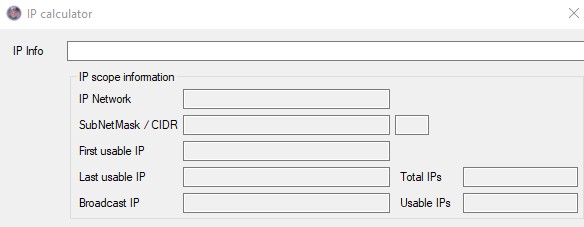 You will find the IP Calculator in the file menu. It is also available in IP Addresses as well as VLANS, where it automatically will show you the results. The IP Calculator works with IPv4 and IPv6 addresses. You will need to enter an IP address with a bitmask in decimal form e.g.: 10.0.0.0/24
Search
Within the application there is a search function that you will come across over and over again. It is highly recommended that you read and understand how this works in order to use the full potential the application.
In the sample picture you see such a search field with about all functions available. The search changes depending on where you see it. Most of the time you will see a horizontal split, search fields above the column names and some buttons underneath.
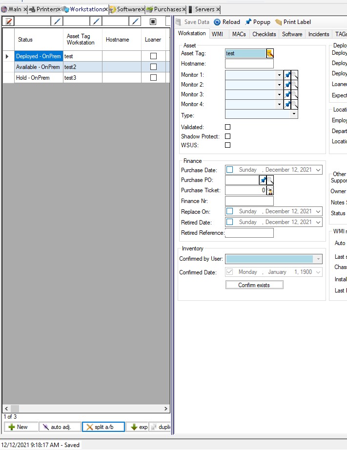 If there is a form you also see a blue line that divides the search from the form. By default, this is set to show the form fully, if possible, you can drag the blue line up/down in horizontal view or left/right in vertical view to adjust the width of the form and search.
Further if there is a button split a/b is visible on the bottom right of the search, you can switch between the horizontal split and the vertical split. This can help to search through data etc.
The auto-adjust button next to it tries to adjust the search and shown form so the form can show all its data.
On the bottom right of the search is an Export button. Here you can export what you currently see in your search form to a CSV file.
Instead of exporting you often can just use keyboard shortcuts like CNTRL+A and CNTRL+C and copy the table e.g., directly to Microsoft Excel.
On the left side under the search, you often see a new button to create a new record. Next to it is a refresh button that will reload the data from the SQL server and the clear button which will reset all filters and show you all data respective as set by default.
More in the middle from the left might be a button like duplicate or other special functions. This button only appears if available for this specific module. To the right of it is a gear like button – this is the default search filter if available. By default, e.g., workstations that are retired will be hidden/excluded by this filter in order to limit the amount of data you see. You can toggle this switch on and off as you need it.
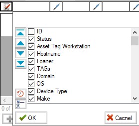 Above the table you have on the very left a button column selector. This button allows you to show and hide columns. You see by default what is set in the configuration, this button now allows you to show any other column that is available in the current SQL query/view. Be aware that you might see some internal columns or even no longer in use columns. However – you are able to make more columns visible if you need them, e.g., the ID column might often come in handy for more special researching. There is a reset button on the left that will set the column order, size and visibility back to default as well.
The columns can also directly drag around (re-order) and adjusted in size. You can double click on a column divider to set it to its optimal width. The same is possible for rows, if they are multi-lined. Please be aware, some columns might be fixed and cannot be moved around. Clicking on any of those column headers will use the column for sorting and alter the sort order.
Version 4.1.2.0 introduced the posibility to save the column settings like width, sort-order and visibility on a per user basis. To save changes, you simply click on the column selector button and close the dialog with OK, now the application will ask you if you want to save the current settings, click OK and you are all set.
To reset these saved settings back to system default, you also open the column selector and click on the reset button (lower left side). Don’t forget to save the settings again.
Above the column headers are a bunch of textboxes and next to them always a little button. The button icon already reveals the type of data you can search for, e.g., text, numbers, dates or on/off (Boolean/checkbox) fields. If you hover of any of these textboxes, you will see tip-texts that show you how you can filter around.
Text-Filters
 You can always use a wildcard within the text you enter. A wildcard is a star * and will always automatically be added in the background at the end of your search value. You can put text in text-quotes to search for an exact phrase, this phrase can have one or more wildcards within and avoids that the default wildcard behind your phrase is added. Putting an exclamation mark! before your phrase, you exclude the phrase from the search. While using a pipe | you can combine one or more phrases and conditions.
Using the button opens a list with either automatically created or pre-defined values. You can click them on and off as needed what will automatically set your search phrase in the textbox.
Numeric-Filters
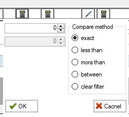 Numeric filters can be the exact number or you can add greaten then < or smaller then > symbols. These also can be used in between two numbers to filter for the range between the provided numbers.
Clicking on the button opens a dialog that helps you setting the filter to the values you want.
Date-Filters
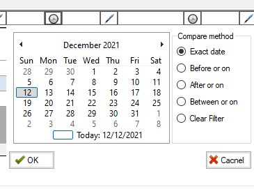 Similar to the numeric filters, you can for a fixed date or a date before < or after > a given value/date. You as well can filter down to a date range in between the defined dates.
The button again opens a dialog box that will help you setting the filter and avoiding mistakes.
Boolean / Checkbox-Filters
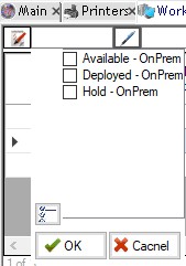
 The simplest of all filters – the Boolean respective checkbox-filter. By default, it is set to a neither status, meaning it will not be engage. You can click on it to either check or uncheck the box and filter accordingly. A third click will set it back to neither.
Double click items to open
In most list a double click on a line item might open the related object in a popup window, if by any means available. This is always a quick way to open the related items and edit them. After a save, you might want to use the refresh button to reload the source list and show the updated data.
Editable lists
Throughout the application there are various lists that you can edit. It can be that you can edit all columns or just specific ones that are shown. This all depends on the configuration of the specific list. However, you can quickly identify these lists as they are green on the line/row header to the left.
Please be aware – any time you edit a line, make sure you go to the previous or next line to make sure the edit was committed and can be saved.
Data forms
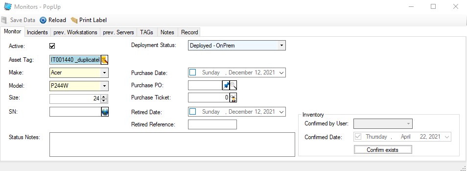 As the sample form in the screenshot shows, there are a few buttons on the upper left of each data form. Here you can by default save (CNTRL+S), popup (CNTRL+P) to pop the form into a separate window or reload (CNTRL+R) the record. In some cases, there are even more option like print label etc.
Record Info and History
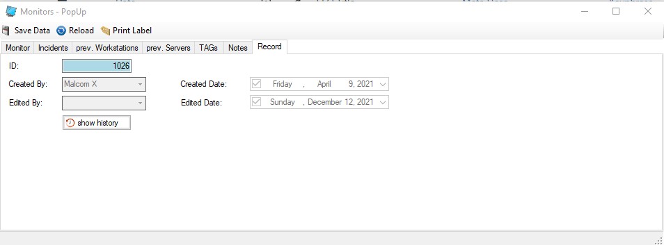 Everything that is entered and saved into the database stays there. You can modify most data, but you can normally not delete anything. On top each change normally leads to a history entry – meaning – every change is tracked, and you can actually look at the history of a record and see how it looked before. Complete record revisions. This information you find always on the tabulator register card Record. Click on the History button to open a read-only version with all previous states of the record.